Data visualization is an important aspect of any data analysis. Representation of information in the form of charts, diagram or picture provides valuable insight about the data including outliers, hot spots and missing data. Especially with large dataset where there are simply too many data points to examine each one, visualizations are helpful tools for understanding the properties of dataset. Having said that usually plotting of large dataset leads to a problem commonly called as overplotting.
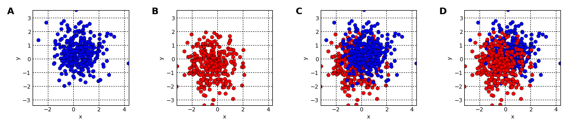
Occlusion of data by other data is called overplotting, and it occurs whenever a datapoint or curve is plotted on top of another datapoint or curve, obscuring it. It’s thus a problem for scatterplots, curve plots, 3D surface plots, 3D bar graphs, and any other plot type where data can be obscured. First lets visualize what is Overplotting using Holoviews.
import numpy as np
np.random.seed(42)

import holoviews as hv
hv.notebook_extension()
%opts Points [color_index=2] (cmap="bwr" edgecolors='k' s=50 alpha=1.0)
%opts Scatter3D [color_index=3 fig_size=250] (cmap='bwr' edgecolor='k' s=50 alpha=1.0)
%opts Image (cmap="gray_r") {+axiswise}

import holoviews.plotting.mpl
holoviews.plotting.mpl.MPLPlot.fig_alpha = 0
holoviews.plotting.mpl.ElementPlot.bgcolor = 'white'
def blues_reds(offset=0.5,pts=300):
    blues = (np.random.normal( offset,size=pts), np.random.normal( offset,size=pts), -1*np.ones((pts)))
    reds  = (np.random.normal(-offset,size=pts), np.random.normal(-offset,size=pts),  1*np.ones((pts)))
    return hv.Points(blues, vdims=['c']), hv.Points(reds, vdims=['c'])

blues,reds = blues_reds()
blues + reds + reds*blues + blues*reds
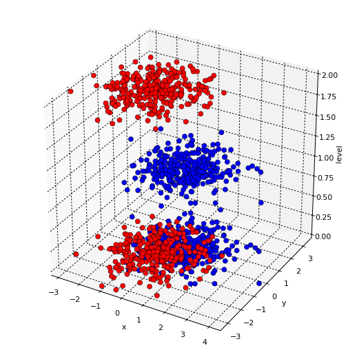
hmap = hv.HoloMap({0:blues,0.000001:reds,1:blues,2:reds}, key_dimensions=['level'])
hv.Scatter3D(hmap.table(), kdims=['x','y','level'], vdims=['c'])
The following plotting techniques discussed can thus be use to overcome overplotting of Large Scale Data.
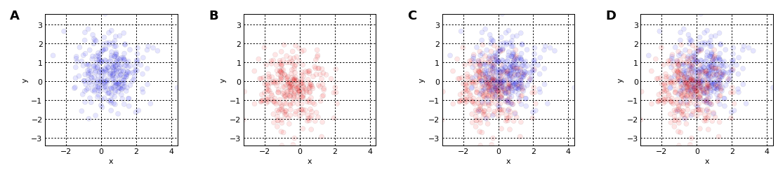
- Data Shadowing and Data Shader
Plotting millions of data point on a Scatter plot directly is not possible with occlusion, therefore we can use the techniques of Data shadowing and shading for plotting large scale data interactively. Data shading automatically reveals valuable details about the data like outliers and missing data.
#Data Shadowing
%%opts Points (s=50 alpha=0.1 edgecolor=None)
blues + reds + reds*blues + blues*reds
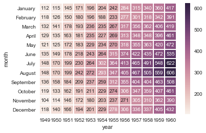
- Annotated heatmaps & interactive plots
A heatmap is a pictorial representation of data where individual points are contained in a matrix that is represented as colors. A simple heat map provides an immediate visual summary of information. More elaborate heat maps allow the viewer to understand complex data sets. The methods discussed until now can be used for Explanatory visualizations for telling data stories to indicate key findings. But at times, we want the user to interactively explore the data, to unearth their own understanding. In that case, we need to build Exploratory visualizations. These visualizations also play an important role to indicate the variation of one attribute with respect to another and therefore are powerful visualization tools especially in case of large datasets.
import seaborn as sns
sns.set()
%matplotlib inline

# Load the example flights dataset and conver to long-form
flights_long = sns.load_dataset("flights")
flights = flights_long.pivot("month", "year", "passengers")

# Draw a heatmap with the numeric values in each cell
sns.heatmap(flights, annot=True, fmt="d", linewidths=1)
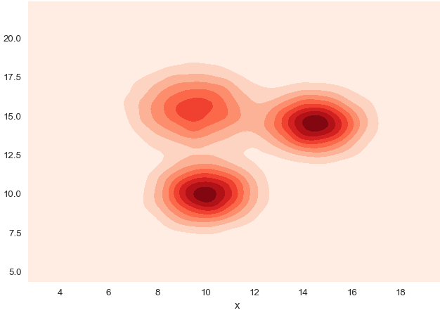
- 2D Density graphs A 2D density plot or 2D histogram is an extension of the well known histogram. It shows the distribution of values in a data set across the range of two quantitative variables. It is really useful to avoid over plotting in a scatterplot.
# Dataset:
df=pd.DataFrame({'x': np.random.normal(10, 1.2, 20000), 'y': np.random.normal(10, 1.2, 20000), 'group': np.repeat('A',20000) })
tmp1=pd.DataFrame({'x': np.random.normal(14.5, 1.2, 20000), 'y': np.random.normal(14.5, 1.2, 20000), 'group': np.repeat('B',20000) })
tmp2=pd.DataFrame({'x': np.random.normal(9.5, 1.5, 20000), 'y': np.random.normal(15.5, 1.5, 20000), 'group': np.repeat('C',20000) })
df=df.append(tmp1).append(tmp2)

# 2D density plot:
sns.kdeplot(df.x, df.y, cmap="Reds", shade=True)
plt.title('Overplotting? Try 2D density graph', loc='left')
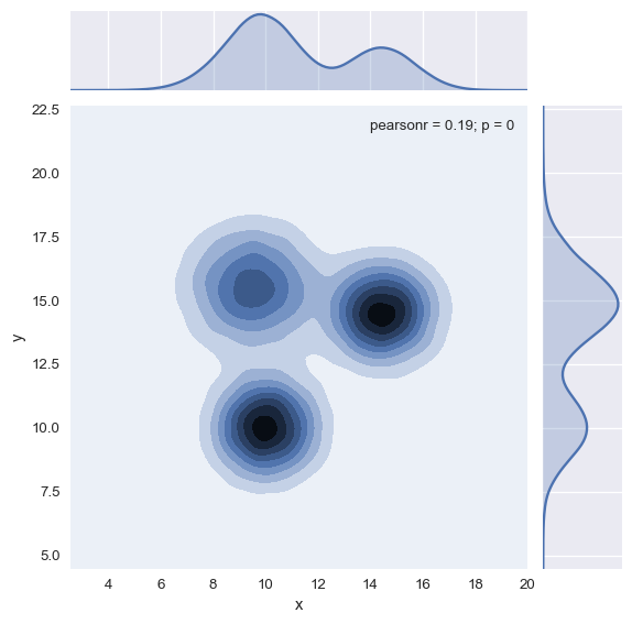
- 2D density & Marginal Distribution If you have a huge amount of dots on your graphic, it is advised to represent the marginal distribution of both the X and Y variables on your 2D Density plot. This is easy to do using the jointplot() function of the Seaborn library.
# 2D density plot with marginal distributions:
sns.jointplot(x=df.x, y=df.y, kind='kde')
By now, you must have realized, how data can be presented using visualization to unearth useful insights. I find performing visualization in Python much easier as compared to R. In this article, I have discussed about deriving various visualizations in Python for Large Datasets. In this process, I made use of matplotlib, seaborn, holoviews & Bokeh libraries in python.